Project Background
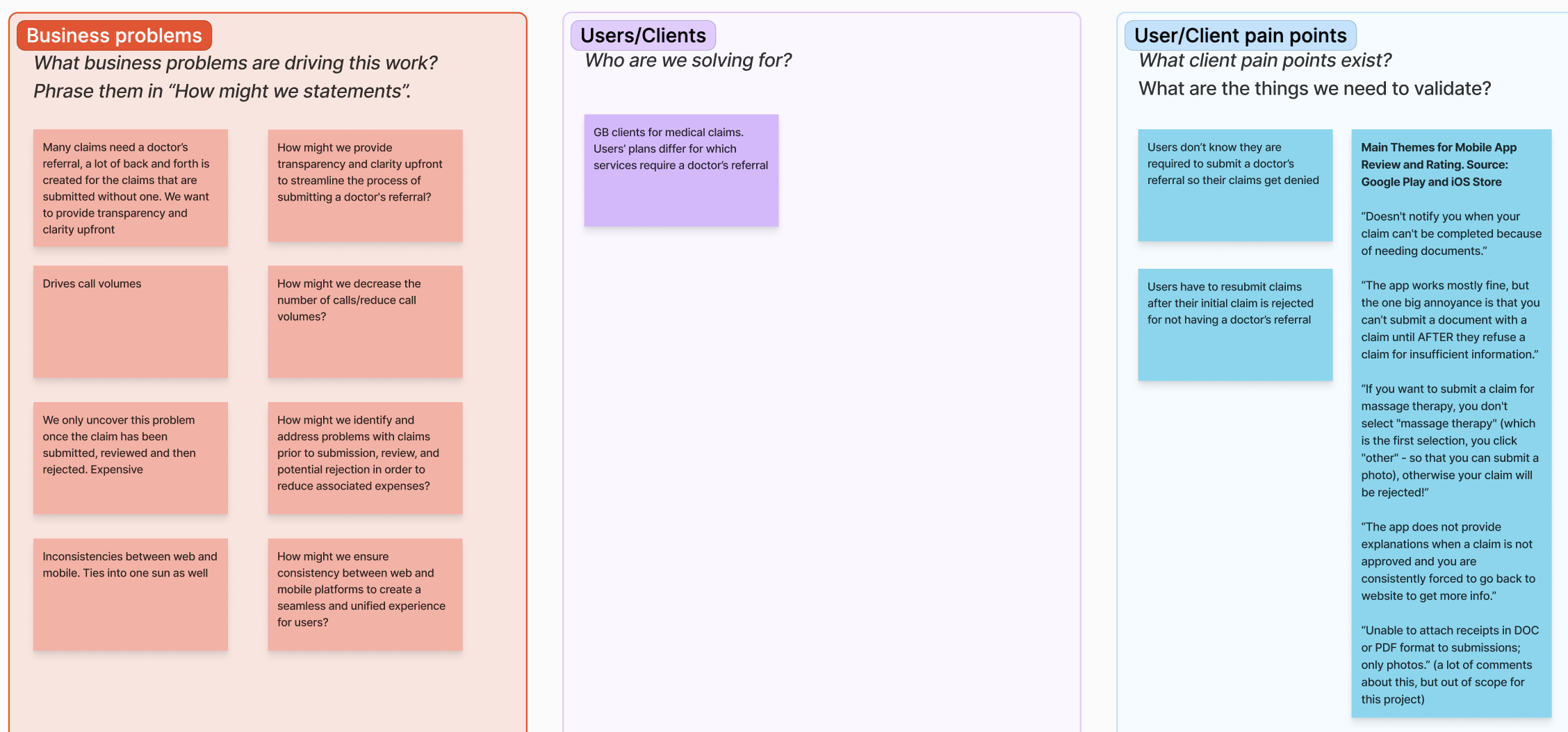
Many health benefits claims require a medical referral to be processed. However, this requirement was not communicated to users during the claim submission flow. Users would only become aware of the missing referral after their claim was declined.
As a result, approximately 8% of claims each year were declined due to missing medical referrals, creating frustration for users and inefficiencies for internal teams.
Workshop
Skills used
Design facilitation
Stakeholder management
Leadership
Collaboration
Communication
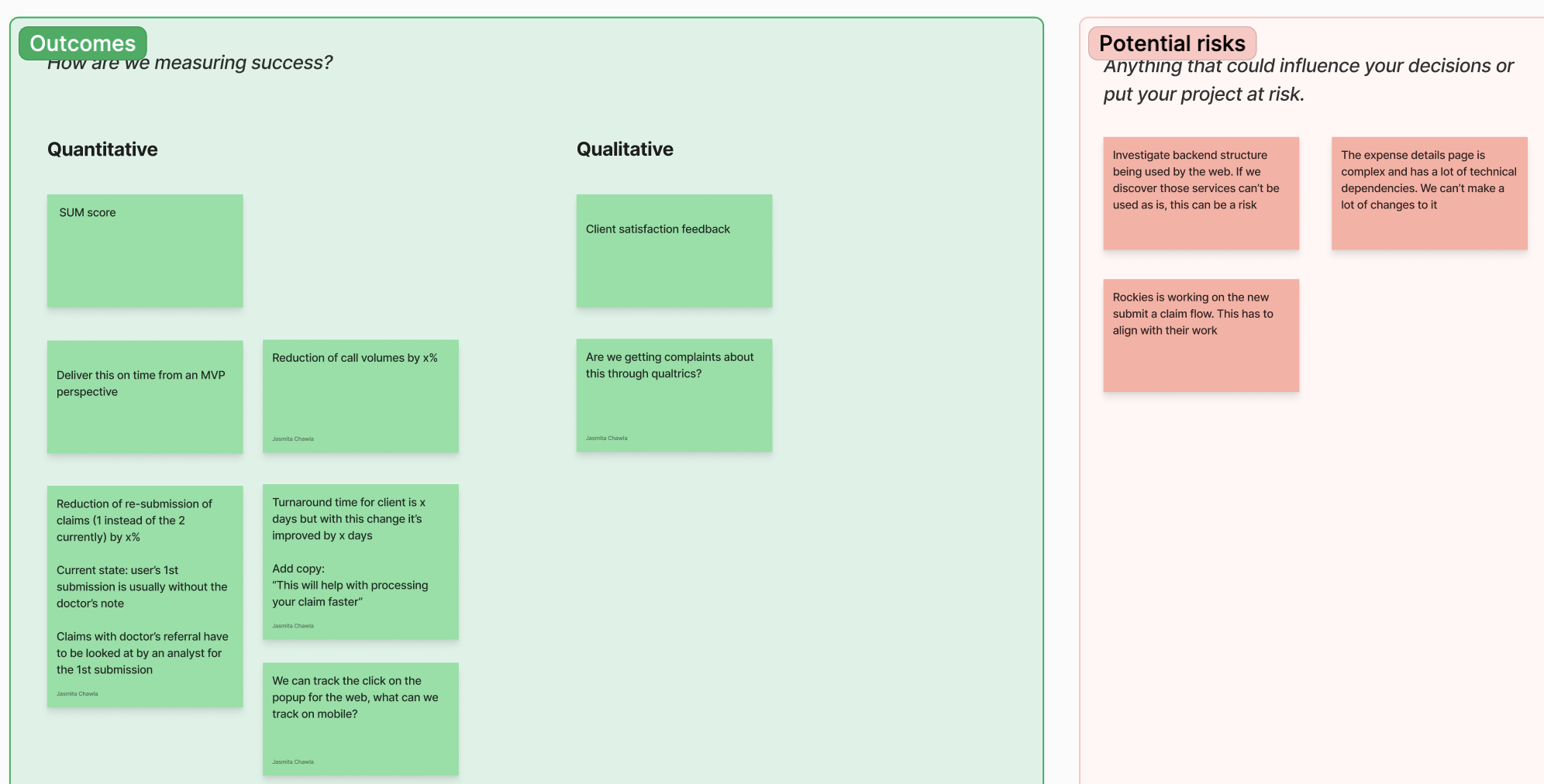
To kick off this project, I facilitated a workshop with business stakeholders, the product owner, developers and the UX writer. The goal was to establish shared alignment early and ensure we were solving the right problem before moving into design.
During the session, we:
- Reviewed the business and user problems
- Defined desired outcomes and success metrics
- Identified potential risks and constraints
I captured and synthesized input from the group using sticky notes which allowed us to surface assumptions, align on priorities and identify areas that required further exploration. The outcomes of this workshop informed the design direction moving forward.
Flow Map
Skills used
Flow mapping
Defining user scenarios
Collaboration
Communication
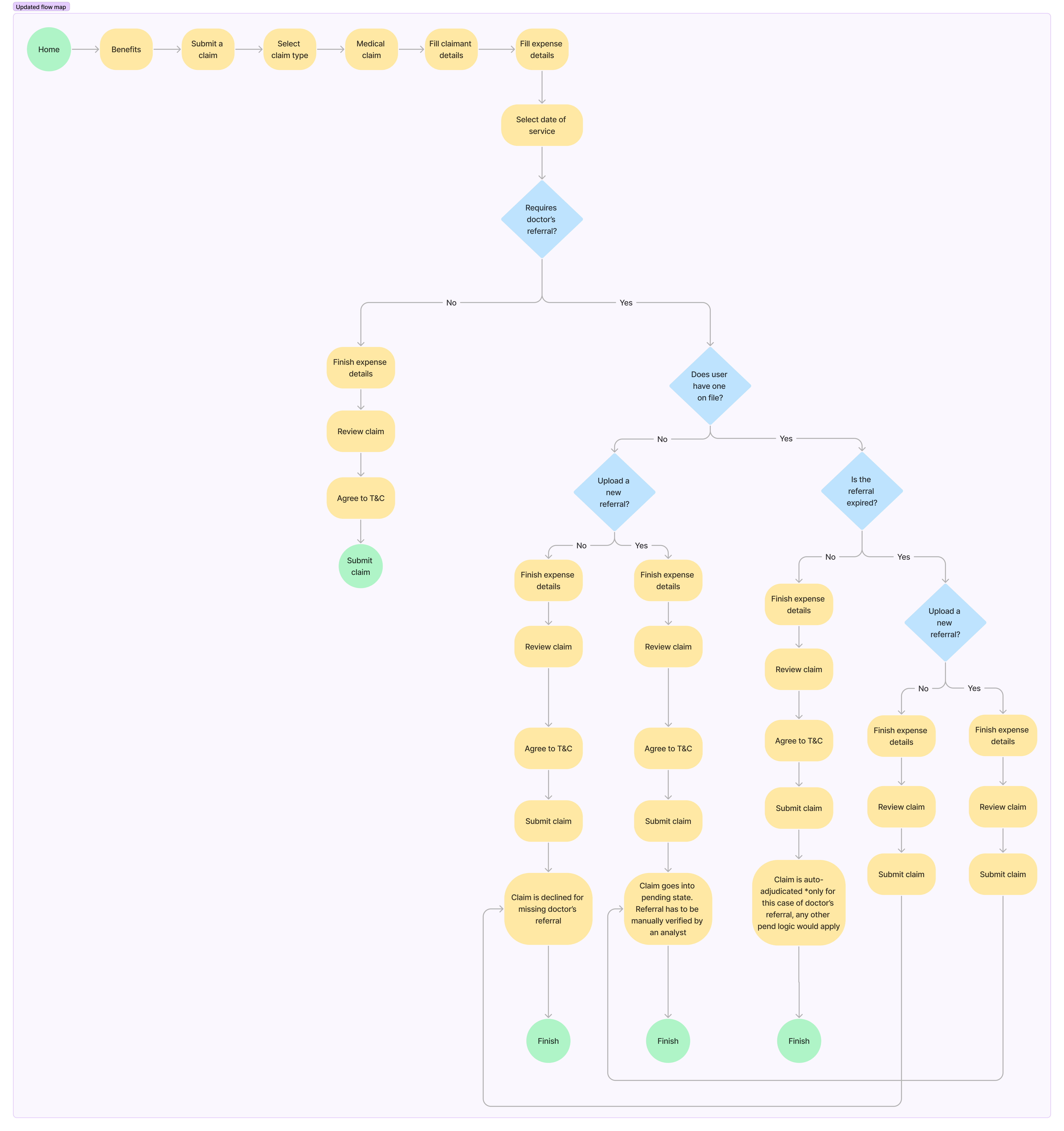
After analyzing the input from the workshop, I created a flow map to define paths users would take depending on their scenario. The goal was to make complex business logic visible and ensure the experience accounted for all edge cases.
I iterated on the flow map with stakeholders to validate assumptions, confirm business rules, and ensure all requirements were accurately represented. This collaborative process helped identify gaps early and aligned the team before moving into detailed design.
Low-Fidelity Wireframes
Skills used
Wireframing
Mobile design
App design
UX design
Collaboration
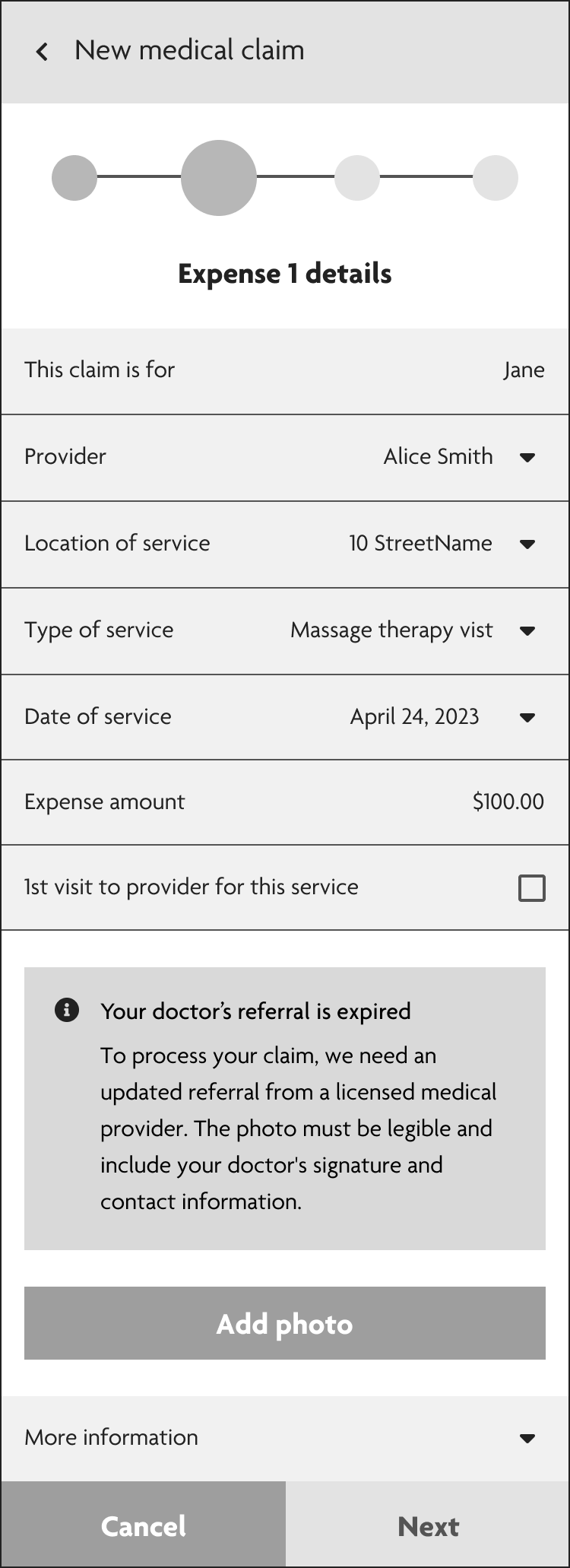
With the user flows defined, I identified 3 primary scenarios. Focusing on these use cases allowed us to design targeted messaging that addressed users' needs in the submission flow. I created low-fidelity wireframes to explore layout and hierarchy, working closely with the UX Writer to ensure the copy was clear and action-orientated.
Scenario 1
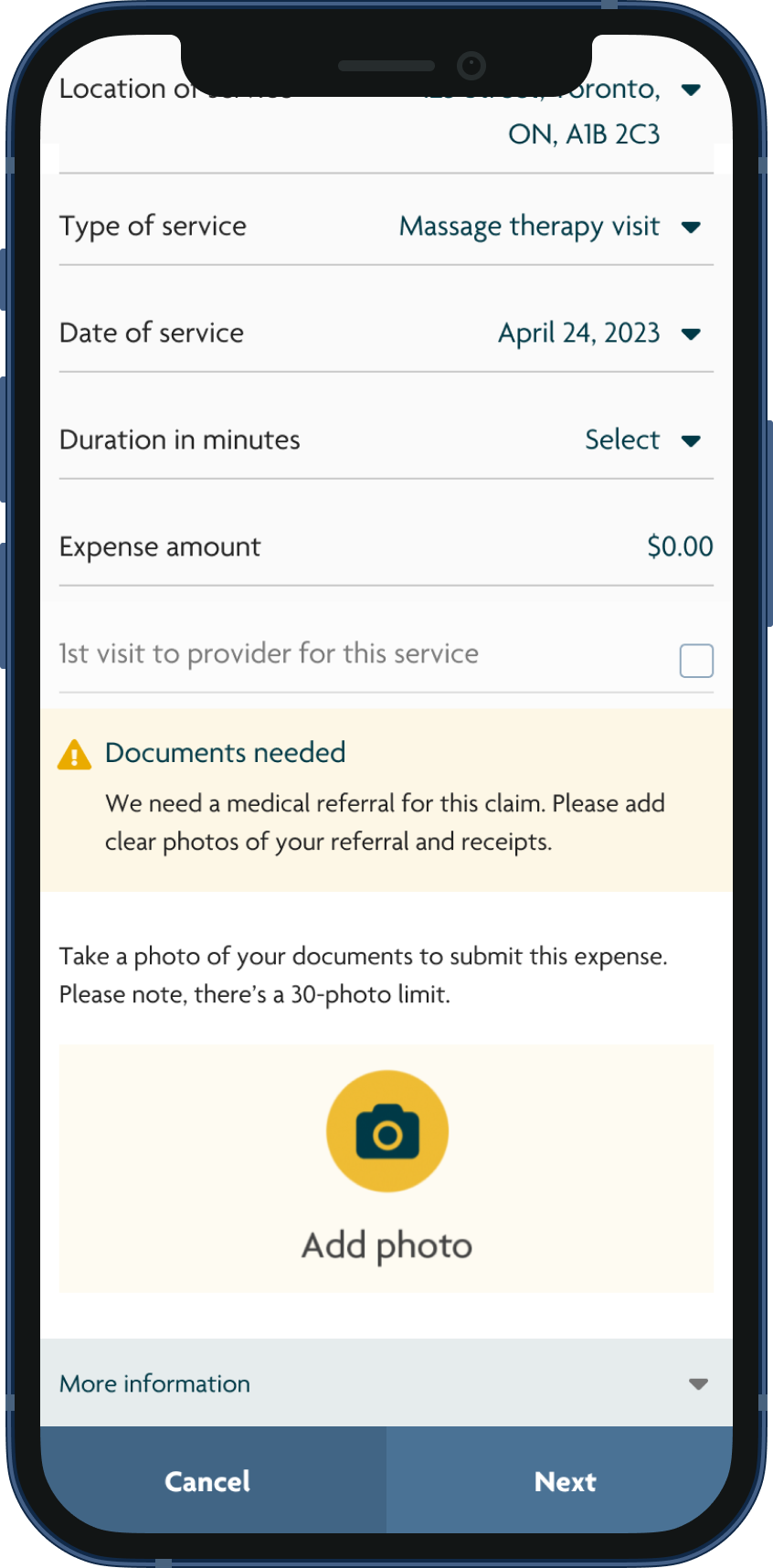
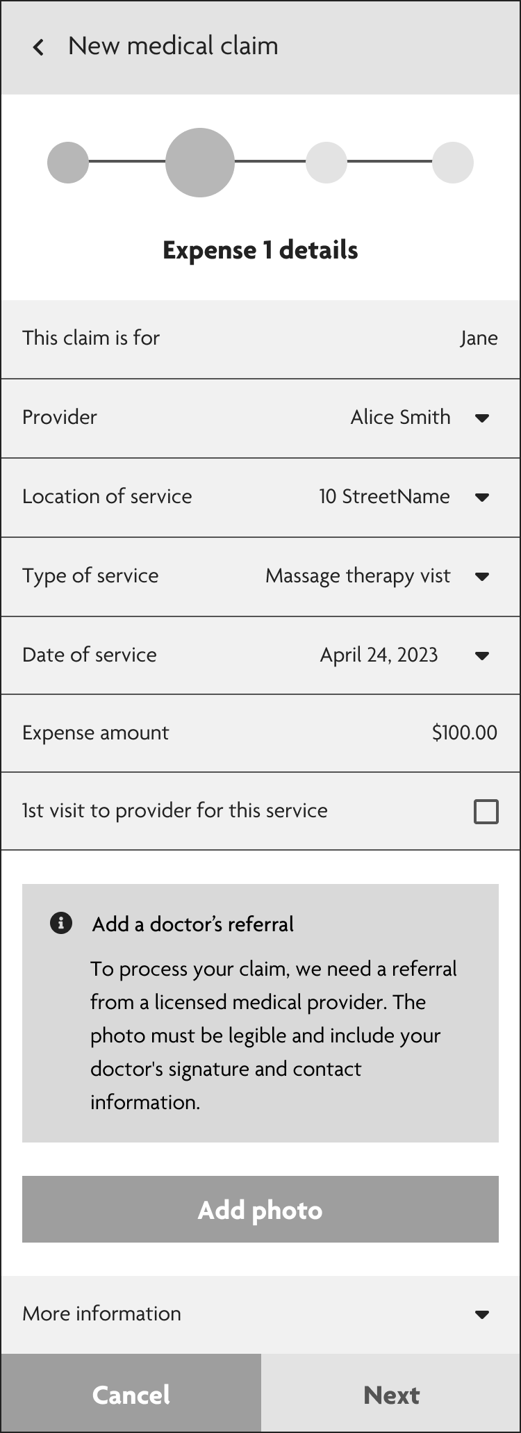
The user doesn’t have a referral on file and is prompted to upload a new one before claim submission
Scenario 2
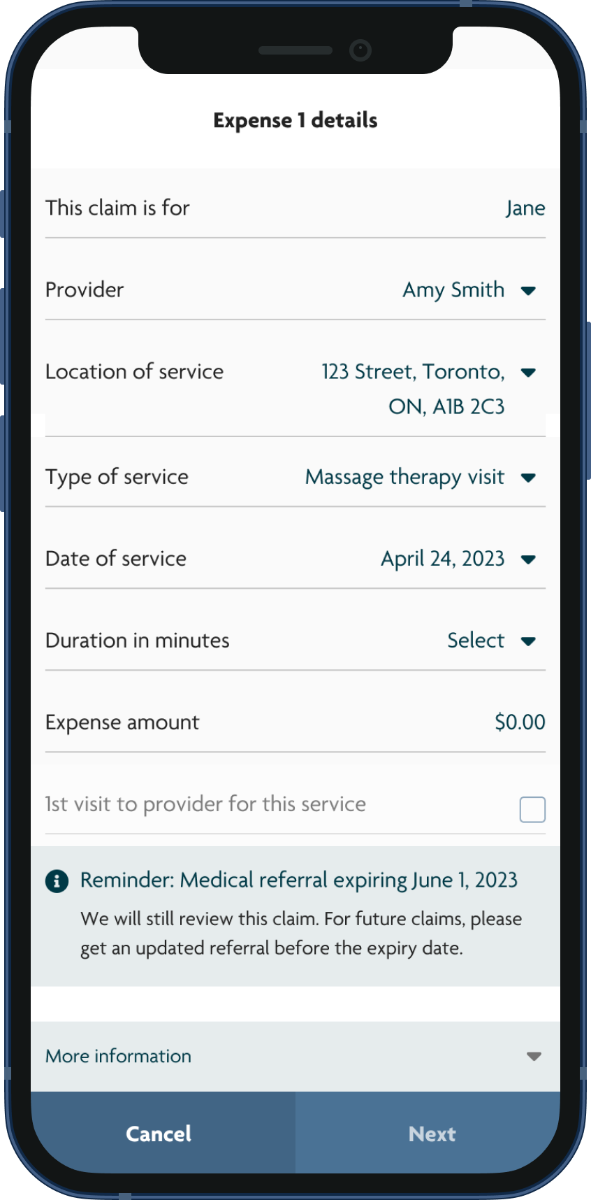
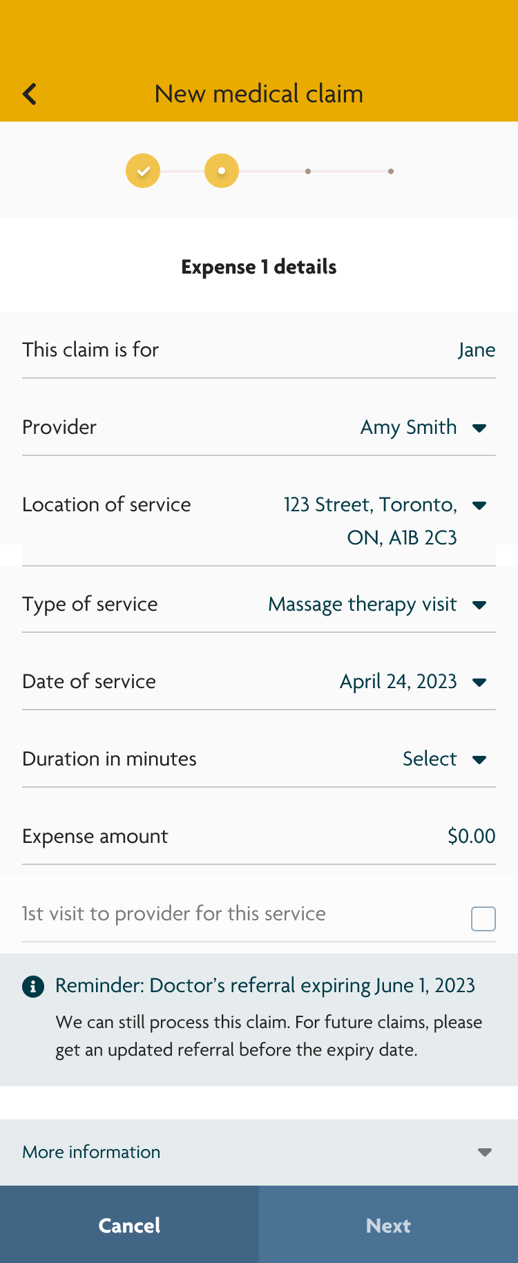
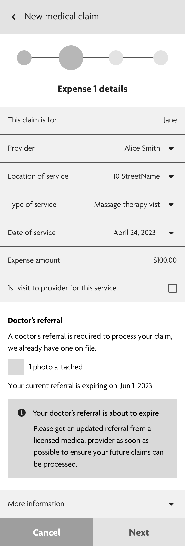
The referral on file is about to expire. Proactively notify users so they can get a new referral ahead of time and avoid a declined claim
Scenario 3
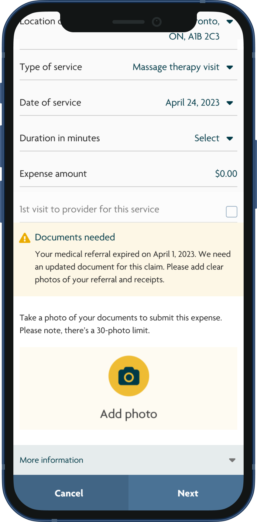
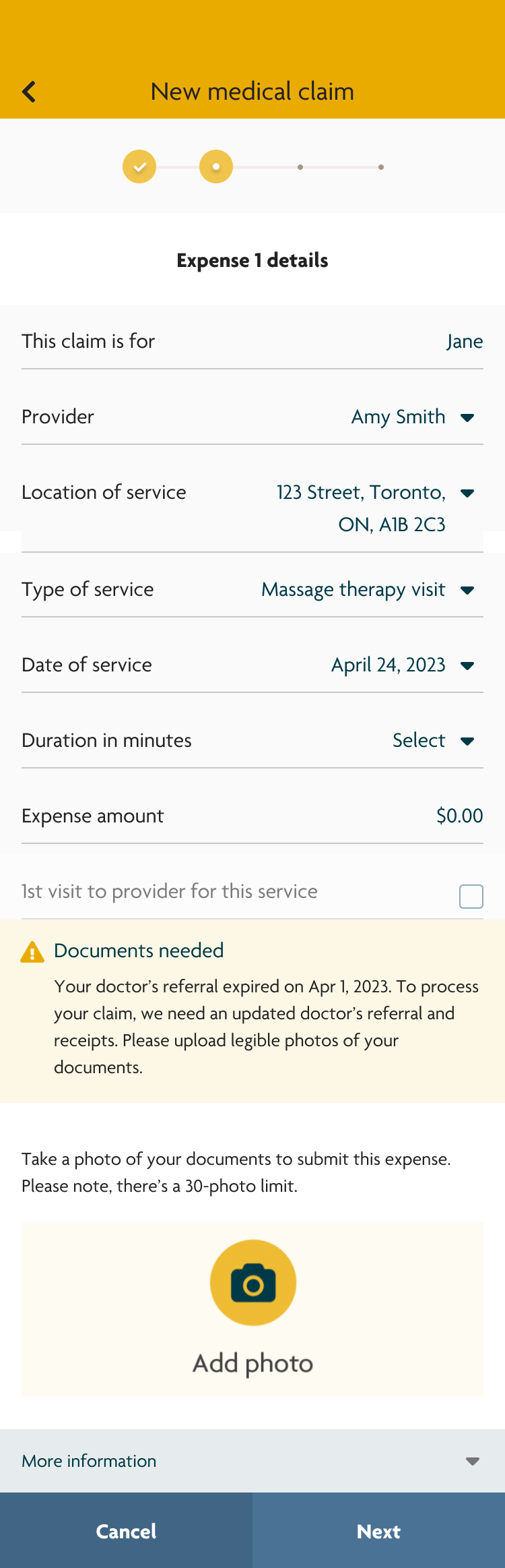
The referral that’s on file has expired. Guide users on how to upload a valid referral
High-Fidelity Prototype
Skills used
Prototyping
Interaction design
Design systems
Mobile design
App design
UX Design
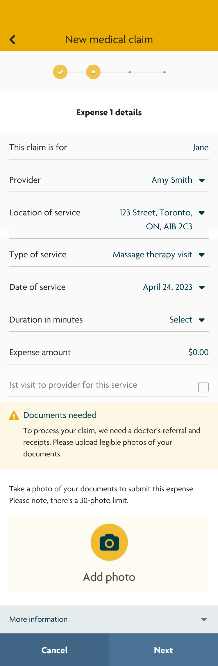
After iterating on the low-fidelity wireframes with stakeholders, I created a high-fidelity interactive prototype using Sun Life’s design system.
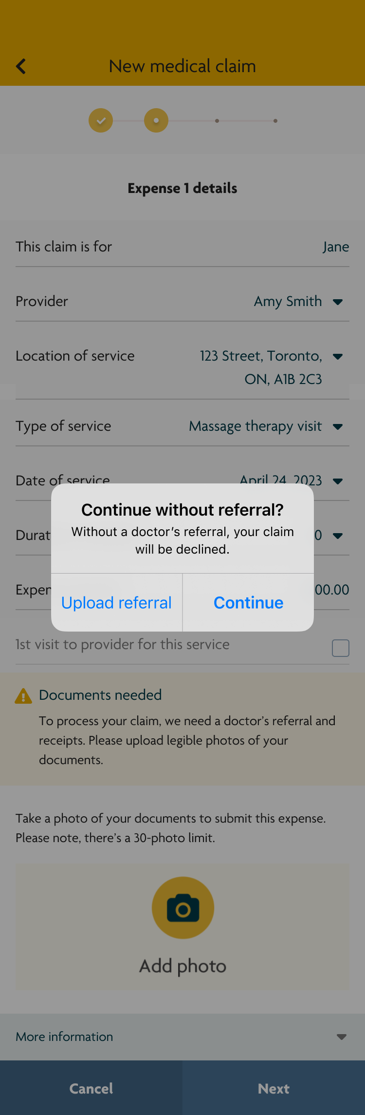
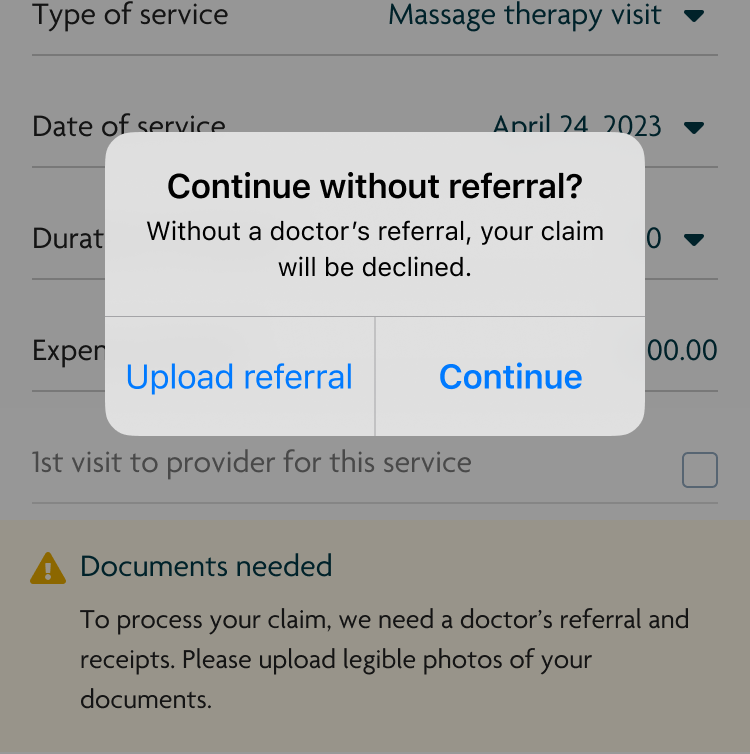
During stakeholder reviews, an additional business requirement emerged: users needed to be able to continue submitting their claim even if they did not have a medical referral on file, despite the likelihood that the claim would be declined.
To balance this requirement with user clarity, I designed a native alert that appeared when users attempted to proceed without a referral. The alert clearly explained the consequence of continuing and encouraged users to add a referral, while still allowing them to move forward if they chose to do so.
User Testing
Skills used
User research
User testing
To validate the effectiveness of the referral messaging and alerts, I conducted unmoderated usability testing with 15 participants using the high-fidelity prototype.
User Testing Objectives
- Do users understand how to upload a referral?
- Do users know what to do when their referral has expired?
- Is proactively notifying users about an upcoming referral expiration helpful?
- Is the native alert effective at encouraging users to upload a referral before continuing?
Key Findings
Around half the participants understood the alert messages and successfully uploaded referrals. Most participants found it helpful to know if their referral was expiring soon as it allowed them to take action ahead of time.
However, the remaining participants skimmed over the alerts that prompted them to upload a referral and continued without one. When they were prompted with the native alert, they only read the title “Continue without referral?” and immediately selected “Continue.”
This indicated that the alert was not clearly communicating the consequence of proceeding without a referral.
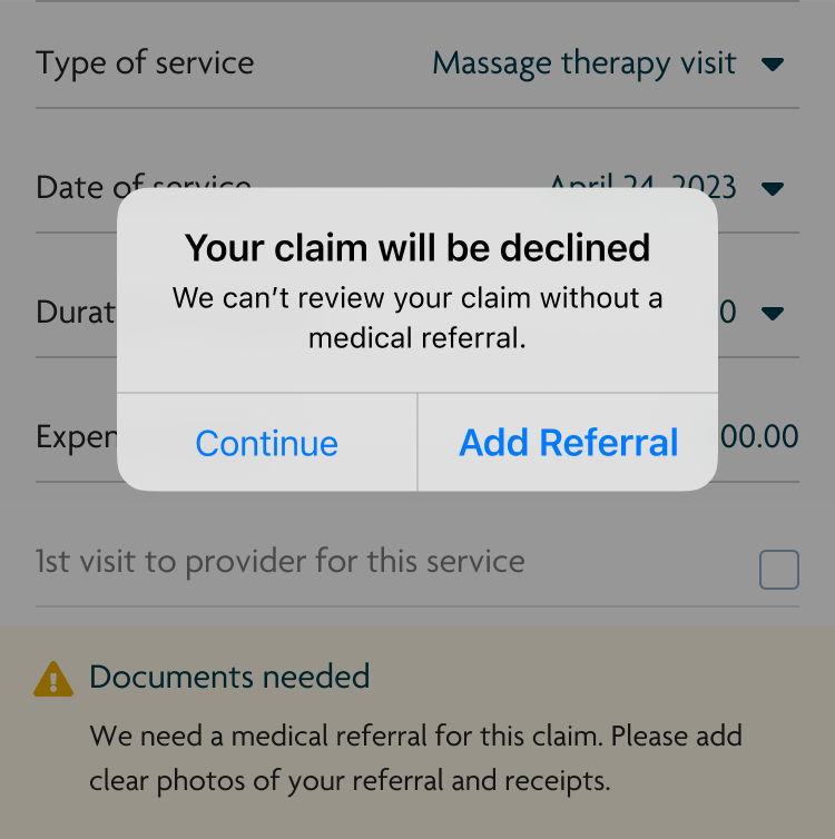
Design Iteration
Based on these insights, I revised the native alert to prioritize consequence-driven clarity:
- Updated the alert title from “Continue without referral?” to “Your claim will be declined” to immediately communicate the outcome
- Changed the primary action from “Continue” to “Add referral” to better guide users toward the desired behavior
Version 1
Version 2
Validation (2nd Round of User Testing)
I conducted a second round of unmoderated testing to evaluate whether the updated design addressed the issue.
The changes were effective. Participants who previously missed or skimmed the inline alerts stopped when they saw that their claim would be declined and chose to go back and upload a referral before continuing.
Project Impact
Between October 2023 and June 2024, 11,402 claims required a medical referral
- 60% of users uploaded a medical referral when prompted
As a result, users were able to submit their claims correctly the first time, avoid unnecessary declines, and receive reimbursement faster
- 80% of users stopped and didn’t submit their claim when they didn’t have a referral
Analysts no longer needed to review and decline claims that were missing required documentation
This project demonstrated how small, targeted UX interventions can significantly improve both user outcomes and operational efficiency at scale.