Overview
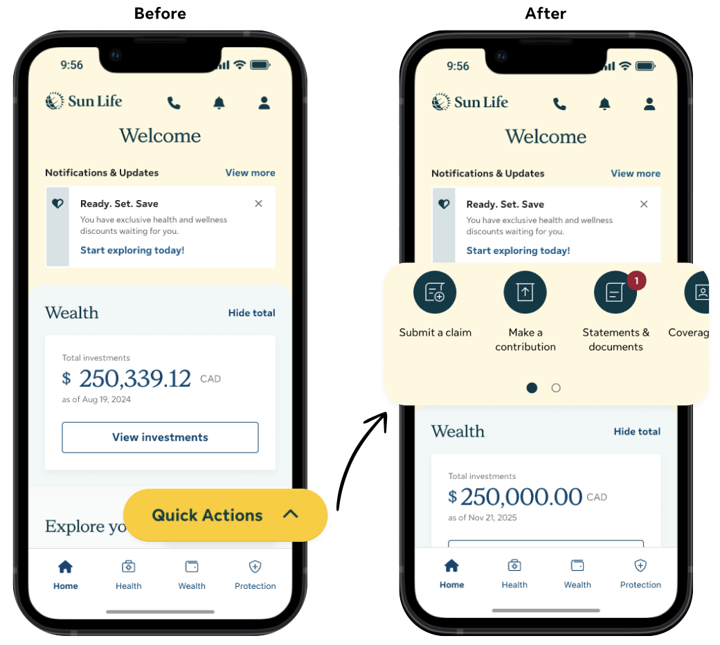
The mobile app used a Floating Action Button (FAB) for primary navigation, which led to low engagement and poor feature discovery. I redesigned the navigation by replacing the FAB with a quick links pattern at the top of each page, making key actions more visible. As a result, engagement with top tasks such as Submit a claim increased by 38%.
Project background
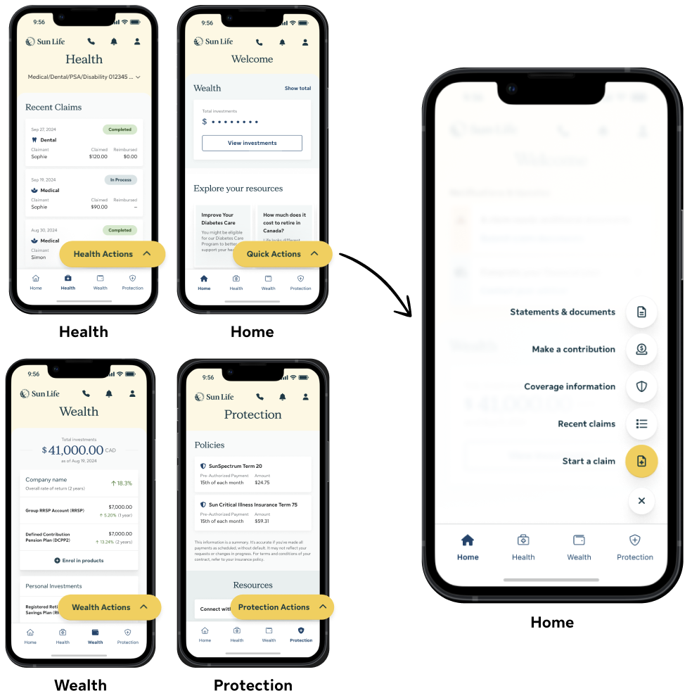
The mobile app relied on the FAB as the primary navigation pattern, originally chosen to provide quick access to key actions while keeping the interface minimal. The FAB appeared on every pillar, but its actions changed by pillar - something most users were unaware of.
User feedback
User feedback from multiple sources revealed significant challenges with navigation and information discovery. Users felt key information was buried and difficult to find, hidden behind layers of menus.
"It's no longer easy to find the options, I have to click in so many options to find what I was looking for..."
- Sun Life member | CSAT (Q3 2025)
"Hard to find some things. I think it should have a menu button at the top of the page. It would be easier to find things"
- Participant | Phase 5 user testing (Q1 2025)
"The new update hides where you can submit a claim..."
- Sun Life member | Play store review (Q4 2025)
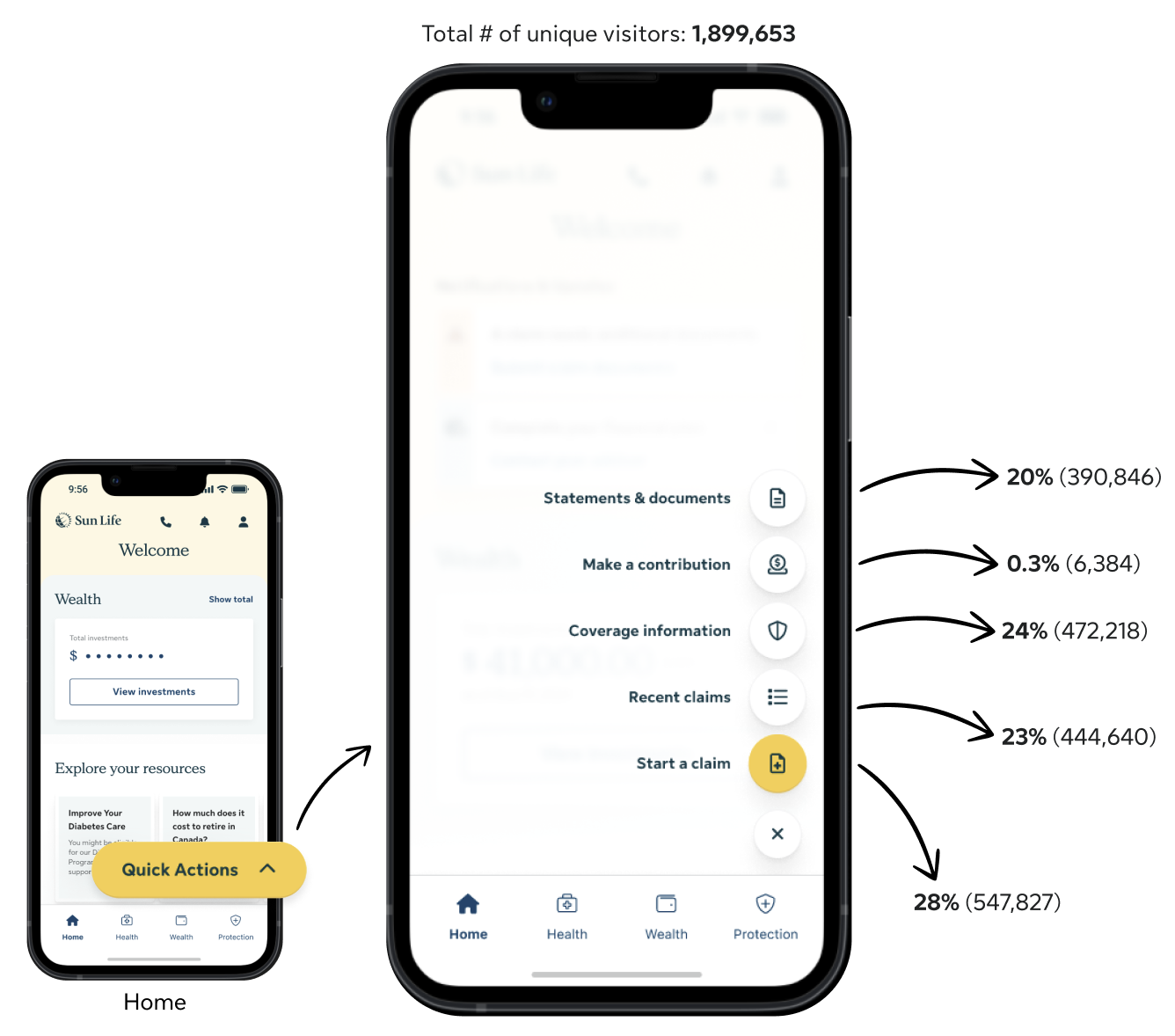
These qualitative insights were reinforced by analytics data. Adobe Analytics showed consistently low engagement with the FAB. Top tasks such as submit a claim was at 28%, make a contribution was at 0.3% and statements & documents at 20%. Engagement also declined as users navigated deeper into the app’s pillar pages, suggesting increasing friction.
Solution
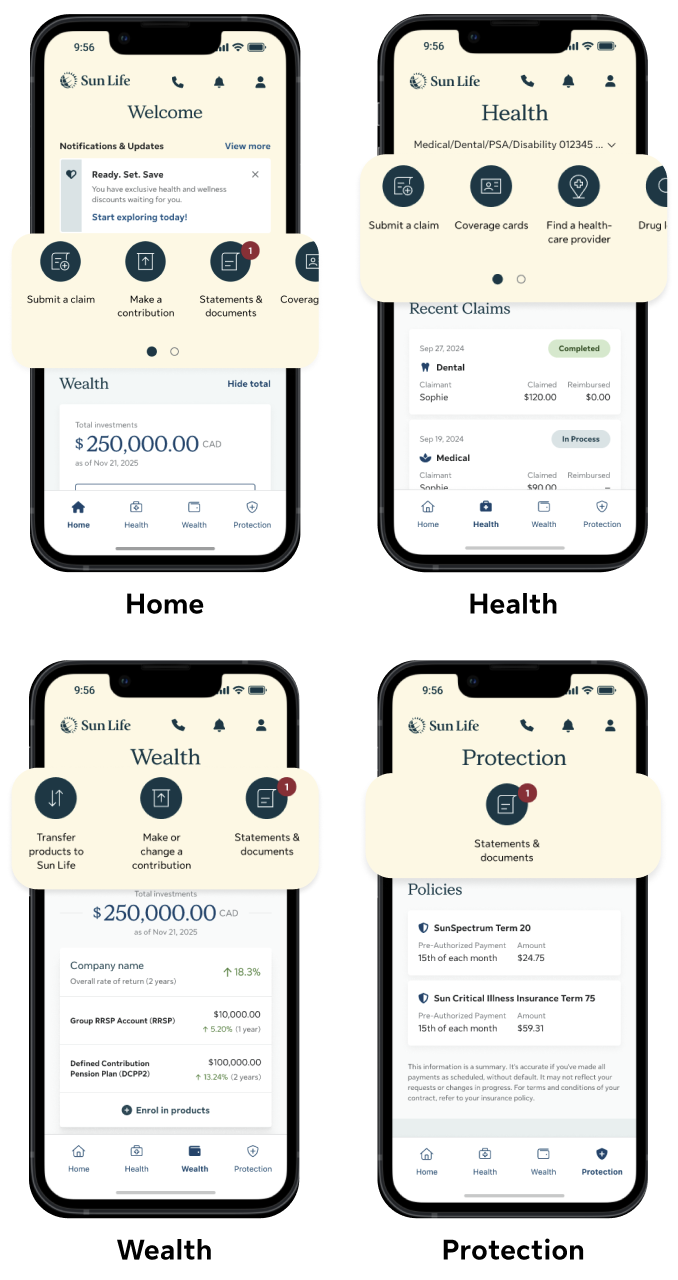
To address the discoverability and navigation issues, I redesigned the app’s primary navigation by replacing the FAB with a persistent quick links pattern at the top of each page. This pattern surfaced key tasks upfront, making them immediately visible and easier to access.
User testing
Usability testing showed that quick links consistently outperformed the FAB across all metrics, including higher SUM scores, improved ease of use, higher task success rates, and faster task completion—indicating reduced cognitive load and friction.
For the task of Submit a claim:

96% SUM score
6.9 out of 7 for ease of use
100% success rate
12s time on task
Validating the navigation redesign
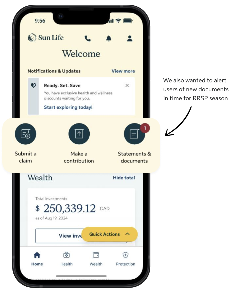
We initially launched the quick links pattern on the homepage with just three links, using a test-and-learn approach to minimize risk. This allowed us to evaluate the effectiveness of quick links against the FAB in a live production environment with real users.
After one month, analytics showed that quick links significantly outperformed the FAB across key tasks:

Submit a claim 38% increase
Make a contribution 7x increase
Statements & documents 6x increase
Expanding across the app
Based on the strong data-backed engagement from the initial rollout, the quick links pattern is going to be expanded to all pillar pages across the app. This will ensure that users are able to consistently access key actions wherever they are in their journey, reducing friction and supporting task completion throughout the experience.